New game changes are horrible.
-
@sakamvari
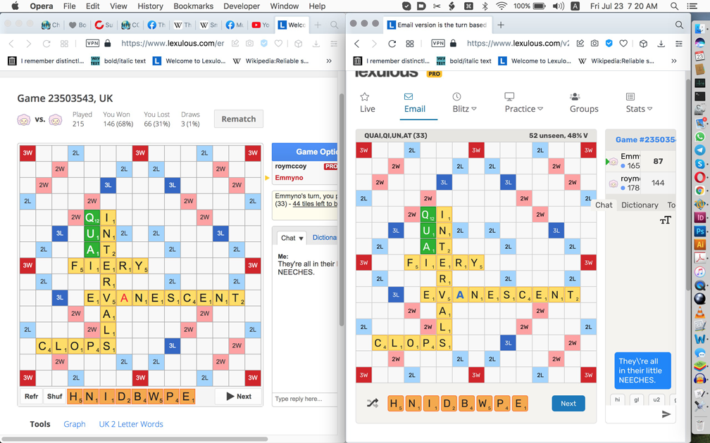
(I had to reduce the Mac 13" screenshot in Photoshop. It was only 600+K, half of the indicated maximum file size 1000+K, but I couldn't place it regardless.)The old layour is on the left, the new on the right. Somebody might think that the new layout looks better, but somebody else may prefer the old one. There is, thus, no remarkable improvement.
The square numbers are smaller in the new layout. Why? Was anyone complaining about their size in the old one? I wasn't. The new ones look spindly, like the tile letters themselves.
A screenshot wasn't or shouldn't have been necessary for these particular two things, but okay, you can see that the rack tiles have a different form than the board tiles in the new layout. I can admit that the rounded corners are nice, but then you have to make them identically rounded on the board also.
So those are the two things for which you requested a screenshot, but now that we have one up:
– I don't like having to mentally reinterpret the shuffle/pass/swap icons. It doesn't require a major mental effort and of course one can get used to it, but there was nothing wrong with the text buttons and I prefer them – again, with the previous "Undo" rather than "Recall", which latter sounds pretentious and I don't like it.
– The blank letters on the board are now blue rather than red. I vastly prefer the red. The blue are no improvement. Please revert to red, the way it was. I don't like the fatter blue letters. Why are they bold, anyway? Was anyone complaining that they didn't stand out enough before? Why should they stand out?
– "Chat" sticks out into the board.
– Can't scroll to right.
– Arrow keys don't work.
– Can't see Settings icon, which should be on the left and the game number should link to something else having to do with the particular game or with numbered games.
– Text-size icon intrudes on chat space (can't see collision here, but they occur). Undesired, as was no problem with size of chat text before. If you want to provide different sizes, this could be changed in preferences rather than constantly taking up space with the undesired icon in the chat pane.
– The two-letter shortcut buttons are 𝘳𝘦𝘢𝘭𝘭𝘺 undesired. Please eliminate or make optional via a preference.
– "Type reply here..." has disappeared. Why? Was anyone complaining about "Type reply here..."?
– "Scribble notes here..." has nonetheless appeared. I'm sure nobody requested this joke, which is not funny after the first time it's seen and not really even then. "Notes" would suffice.
– I have previously commented on the capitalization inconsistency with lowercase "unseen" and uppercase "V". I previously mentioned the possibility of "vowels", but you could also simply eliminate the vowel percentage, which often isn't going to be useful because it doesn't say 𝘸𝘩𝘪𝘤𝘩 vowels and if someone wants to see which letters are left he/she will generally want to do that without being immediately concerned with the vowel percentage.
The new version is playable and I accept it sometimes, but I prefer the old one, will generally continue reverting to it, and hope it remains possible to do so.
@roymccoy Thank you for sharing your valuable feedback with us regarding the improvements. We will definitely try to make it better. There are some additional features in the new format, you can check that out from this link: https://forum.lexulous.com/topic/635/2021-new-format?_=1627099179281
-
@sakamvari
(I had to reduce the Mac 13" screenshot in Photoshop. It was only 600+K, half of the indicated maximum file size 1000+K, but I couldn't place it regardless.)The old layour is on the left, the new on the right. Somebody might think that the new layout looks better, but somebody else may prefer the old one. There is, thus, no remarkable improvement.
The square numbers are smaller in the new layout. Why? Was anyone complaining about their size in the old one? I wasn't. The new ones look spindly, like the tile letters themselves.
A screenshot wasn't or shouldn't have been necessary for these particular two things, but okay, you can see that the rack tiles have a different form than the board tiles in the new layout. I can admit that the rounded corners are nice, but then you have to make them identically rounded on the board also.
So those are the two things for which you requested a screenshot, but now that we have one up:
– I don't like having to mentally reinterpret the shuffle/pass/swap icons. It doesn't require a major mental effort and of course one can get used to it, but there was nothing wrong with the text buttons and I prefer them – again, with the previous "Undo" rather than "Recall", which latter sounds pretentious and I don't like it.
– The blank letters on the board are now blue rather than red. I vastly prefer the red. The blue are no improvement. Please revert to red, the way it was. I don't like the fatter blue letters. Why are they bold, anyway? Was anyone complaining that they didn't stand out enough before? Why should they stand out?
– "Chat" sticks out into the board.
– Can't scroll to right.
– Arrow keys don't work.
– Can't see Settings icon, which should be on the left and the game number should link to something else having to do with the particular game or with numbered games.
– Text-size icon intrudes on chat space (can't see collision here, but they occur). Undesired, as was no problem with size of chat text before. If you want to provide different sizes, this could be changed in preferences rather than constantly taking up space with the undesired icon in the chat pane.
– The two-letter shortcut buttons are 𝘳𝘦𝘢𝘭𝘭𝘺 undesired. Please eliminate or make optional via a preference.
– "Type reply here..." has disappeared. Why? Was anyone complaining about "Type reply here..."?
– "Scribble notes here..." has nonetheless appeared. I'm sure nobody requested this joke, which is not funny after the first time it's seen and not really even then. "Notes" would suffice.
– I have previously commented on the capitalization inconsistency with lowercase "unseen" and uppercase "V". I previously mentioned the possibility of "vowels", but you could also simply eliminate the vowel percentage, which often isn't going to be useful because it doesn't say 𝘸𝘩𝘪𝘤𝘩 vowels and if someone wants to see which letters are left he/she will generally want to do that without being immediately concerned with the vowel percentage.
The new version is playable and I accept it sometimes, but I prefer the old one, will generally continue reverting to it, and hope it remains possible to do so.
@roymccoy I totally agree with what you've said. Somebody had too much time on their hands.
-
Of course they're for real.
Do you think I'd make up not liking the ugly black arrow?@roymccoy of course not ..it would be at the top of the game change list...and the rest of them?
-
Of course they're for real.
Do you think I'd make up not liking the ugly black arrow? -
@roymccoy Thank you for sharing your valuable feedback with us regarding the improvements. We will definitely try to make it better. There are some additional features in the new format, you can check that out from this link: https://forum.lexulous.com/topic/635/2021-new-format?_=1627099179281
@sakamvari With the new game, I can see the remaining tiles on my opponent's rack. Whenever the unseen tiles fall below 17, whatever shows when you click "unseen tiles" is what your opponent has. You might want to change that.
-
I'm a retired proofreader. It's in my blood. The black arrow is ugly and the red-letter blank was fine.
-
Here's another real post and a serious proposal.
I can see and grant that the size of the tile letters in the old layout could stand to come down a little. But they may have been brought down a little too much. It looks that way to me, at least. So one thing you could do, I'm sure, is try the size exactly halfway between the two. I think that would wind up being an acceptable compromise. Thank you.
-
And the same with the tile numbers.
-
@roymccoy of course not ..it would be at the top of the game change list...and the rest of them?
I already said. Specifically about the ugly black arrow, I would expect to hear something like "We'd like to keep the same green arrow but we can't, because..."
On the tile letters, another possibility (than the one already proposed, to use a size midway between the old one and the new one) might be to use a slightly bolder version of the typeface if one is available. Some typefaces have a wide range of weights, and perhaps this typeface is one of them.
-
I'm a retired proofreader. It's in my blood. The black arrow is ugly and the red-letter blank was fine.
@roymccoy From one retired proofreader to another: I totally agree with you.
-
@naniel I see real changes that need to be made..but that is me
-
@sakamvari With the new game, I can see the remaining tiles on my opponent's rack. Whenever the unseen tiles fall below 17, whatever shows when you click "unseen tiles" is what your opponent has. You might want to change that.
@57chevvie
Pretty sure this has always been the case. Since it is known what letters are available in the game, one could look at the board and be able to figure out what letters are unseen, whether still to be drawn, or in your opponent's hand. Personally, I'm not that sharp, so it's nice that the game gives you a little extra help in this regard...
-
@sakamvari With the new game, I can see the remaining tiles on my opponent's rack. Whenever the unseen tiles fall below 17, whatever shows when you click "unseen tiles" is what your opponent has. You might want to change that.
@57chevvie Thank you for your valuable feedback. We will try to include that.
-
Here's another real post and a serious proposal.
I can see and grant that the size of the tile letters in the old layout could stand to come down a little. But they may have been brought down a little too much. It looks that way to me, at least. So one thing you could do, I'm sure, is try the size exactly halfway between the two. I think that would wind up being an acceptable compromise. Thank you.
@roymccoy And for goodness sake, change that hideous capital J.
-
@roymccoy From one retired proofreader to another: I totally agree with you.
@57chevvie as retired proofreaders, you are retired.
-
@roymccoy And for goodness sake, change that hideous capital J.
@57chevvie
Oh my word, you're right. I hadn't seen that, probably because I was playing in the old version. A reversion to the previous typeface would take care of this immediately, and I don't suppose that anything other than some typeface change will correct it (unless a customized typeface is used – I used a program called Fontographer to customize the fonts I used on a Mac at work).I'm wondering if the old version hasn't been modified recently. When looking at it before in comparison to the new version, I had to admit that the tile letters looked fat. Now, however, they look fine, as if they'd been discreetly thinned down. ???
-
@57chevvie as retired proofreaders, you are retired.
@betterlate1-0 I have retired from paid employment. I have not retired from life.
-
@57chevvie as retired proofreaders, you are retired.
@betterlate1-0 I have retired from paid employment. I have not retired my brain.
-
I already said. Specifically about the ugly black arrow, I would expect to hear something like "We'd like to keep the same green arrow but we can't, because..."
On the tile letters, another possibility (than the one already proposed, to use a size midway between the old one and the new one) might be to use a slightly bolder version of the typeface if one is available. Some typefaces have a wide range of weights, and perhaps this typeface is one of them.
@roymccoy Why do you want them to please your color choices. I can think of serious issues that need changes to benefit all. Your changes are to benefit you. Guessing you do not pay, I do and I can still think if changes to benefit all that do not seem to get done. color of arrow no big deal. Incidentally pop up ads? pay to play or go on the net to get an adblocker. Just some thoughts
-
@roymccoy Why do you want them to please your color choices. I can think of serious issues that need changes to benefit all. Your changes are to benefit you. Guessing you do not pay, I do and I can still think if changes to benefit all that do not seem to get done. color of arrow no big deal. Incidentally pop up ads? pay to play or go on the net to get an adblocker. Just some thoughts
@betternever1-0
You're presumably talking about the green arrow and the red blank letters, neither of which are my color choices. None of my other suggestions are particularly idiosyncratic either, as you imply. I do pay, despite rarely analyzing games, so you don't get to plomp yourself into a higher class of Lexulous observers. Please think a little more before posting your thoughts, thanks.