Why the Black Arrow Is Ugly
-
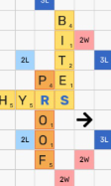
Here are the unattractively misaligned, optical-illusion-smaller blue blank letters again (please restore previous normal red), but the reason I'm writing now is that I finally figured out 𝘸𝘩𝘺 the black arrow is so particularly ugly. It's big, bold and black on a pristinely white background, that's why, and this is in stark contrast to the wimpy tile letters. It would work better with the larger, bolder letters of the old version, but they ain't there no more. So the arrow sticks out in contrast to both the starkly white background and the wimpy letters. Why were the letters made less bold but the arrow more bold? It doesn't make sense from a design standpoint. No reason or justification has yet been provided for why the nice green arrow was replaced with this ugly, too-bold black one. Plus it doesn't 𝘮𝘰𝘷𝘦 with the arrow keys. I'll grant that this misfunction may finally be more important than the aspect of the arrow, but I don't see why you couldn't restore the green arrow while trying to get the arrow to work generally (which I suppose you're doing).
-
Here are the unattractively misaligned, optical-illusion-smaller blue blank letters again (please restore previous normal red), but the reason I'm writing now is that I finally figured out 𝘸𝘩𝘺 the black arrow is so particularly ugly. It's big, bold and black on a pristinely white background, that's why, and this is in stark contrast to the wimpy tile letters. It would work better with the larger, bolder letters of the old version, but they ain't there no more. So the arrow sticks out in contrast to both the starkly white background and the wimpy letters. Why were the letters made less bold but the arrow more bold? It doesn't make sense from a design standpoint. No reason or justification has yet been provided for why the nice green arrow was replaced with this ugly, too-bold black one. Plus it doesn't 𝘮𝘰𝘷𝘦 with the arrow keys. I'll grant that this misfunction may finally be more important than the aspect of the arrow, but I don't see why you couldn't restore the green arrow while trying to get the arrow to work generally (which I suppose you're doing).
This post is deleted! -
Here are the unattractively misaligned, optical-illusion-smaller blue blank letters again (please restore previous normal red), but the reason I'm writing now is that I finally figured out 𝘸𝘩𝘺 the black arrow is so particularly ugly. It's big, bold and black on a pristinely white background, that's why, and this is in stark contrast to the wimpy tile letters. It would work better with the larger, bolder letters of the old version, but they ain't there no more. So the arrow sticks out in contrast to both the starkly white background and the wimpy letters. Why were the letters made less bold but the arrow more bold? It doesn't make sense from a design standpoint. No reason or justification has yet been provided for why the nice green arrow was replaced with this ugly, too-bold black one. Plus it doesn't 𝘮𝘰𝘷𝘦 with the arrow keys. I'll grant that this misfunction may finally be more important than the aspect of the arrow, but I don't see why you couldn't restore the green arrow while trying to get the arrow to work generally (which I suppose you're doing).
@roymccoy What an odd complaint!
To be honest with you, lexulous looks pretty good to my eye-- way better than another word game site I'm on.
Except for the avatars. I find a lot of them to be pretty awful.
-
This post is deleted!
@betterlate1-0 not going to please everyone but everyone has their own taste.
-
@roymccoy What an odd complaint!
To be honest with you, lexulous looks pretty good to my eye-- way better than another word game site I'm on.
Except for the avatars. I find a lot of them to be pretty awful.
@zaph Thank you for your valuable feedback. We will try to change that.
-
Here are the unattractively misaligned, optical-illusion-smaller blue blank letters again (please restore previous normal red), but the reason I'm writing now is that I finally figured out 𝘸𝘩𝘺 the black arrow is so particularly ugly. It's big, bold and black on a pristinely white background, that's why, and this is in stark contrast to the wimpy tile letters. It would work better with the larger, bolder letters of the old version, but they ain't there no more. So the arrow sticks out in contrast to both the starkly white background and the wimpy letters. Why were the letters made less bold but the arrow more bold? It doesn't make sense from a design standpoint. No reason or justification has yet been provided for why the nice green arrow was replaced with this ugly, too-bold black one. Plus it doesn't 𝘮𝘰𝘷𝘦 with the arrow keys. I'll grant that this misfunction may finally be more important than the aspect of the arrow, but I don't see why you couldn't restore the green arrow while trying to get the arrow to work generally (which I suppose you're doing).
I'm sorry I said "wimpy" tile letters. I should have said simply "thinner". I still feel there should be a straight compromise between the "fat" letters of the old version and the "skinny" letters of the new.
-
@roymccoy What an odd complaint!
To be honest with you, lexulous looks pretty good to my eye-- way better than another word game site I'm on.
Except for the avatars. I find a lot of them to be pretty awful.
@zaph
I don't play the other word games and haven't seen any of them in a long time, so I wouldn't know. -
Here are the unattractively misaligned, optical-illusion-smaller blue blank letters again (please restore previous normal red), but the reason I'm writing now is that I finally figured out 𝘸𝘩𝘺 the black arrow is so particularly ugly. It's big, bold and black on a pristinely white background, that's why, and this is in stark contrast to the wimpy tile letters. It would work better with the larger, bolder letters of the old version, but they ain't there no more. So the arrow sticks out in contrast to both the starkly white background and the wimpy letters. Why were the letters made less bold but the arrow more bold? It doesn't make sense from a design standpoint. No reason or justification has yet been provided for why the nice green arrow was replaced with this ugly, too-bold black one. Plus it doesn't 𝘮𝘰𝘷𝘦 with the arrow keys. I'll grant that this misfunction may finally be more important than the aspect of the arrow, but I don't see why you couldn't restore the green arrow while trying to get the arrow to work generally (which I suppose you're doing).
@roymccoy this is funny, don't even care if you aren't being sarcastic this time.
-
Newbie here. What are the arrows for?
-
Newbie here. What are the arrows for?
@mistertoad Inputting words more efficiently than dragging tiles to the board (such as keyboard input). Click or tap the board once or twice for a direction arrow, then type your word. Backspace to delete, escape to remove whole word. You can also click/tap tiles to place and remove them.
-
@mistertoad Inputting words more efficiently than dragging tiles to the board (such as keyboard input). Click or tap the board once or twice for a direction arrow, then type your word. Backspace to delete, escape to remove whole word. You can also click/tap tiles to place and remove them.
@dan-mitchell @lexulous Arrows should be aim and fire but I generally do not use them. Most often the arrow I have learned that arrow does not work if you try to type onto a colored square.
-
@dan-mitchell @lexulous Arrows should be aim and fire but I generally do not use them. Most often the arrow I have learned that arrow does not work if you try to type onto a colored square.
@betterlate1-0 Never had a problem with them myself, but we all have our own preferences.
-
@betterlate1-0 Never had a problem with them myself, but we all have our own preferences.
@dan-mitchell First apologies to all, because of all I go through here to post I do not pay as much attention to sentences or structure as I should . Just want to get words down and send. Apparently what I thought I had initially erased I did not. Now to the topic at hand. Arrows are not about preferences. But, since you mention it I would prefer arrows worked.
-
@mistertoad Inputting words more efficiently than dragging tiles to the board (such as keyboard input). Click or tap the board once or twice for a direction arrow, then type your word. Backspace to delete, escape to remove whole word. You can also click/tap tiles to place and remove them.
@dan-mitchell
Thanks, Dan! -
@dan-mitchell First apologies to all, because of all I go through here to post I do not pay as much attention to sentences or structure as I should . Just want to get words down and send. Apparently what I thought I had initially erased I did not. Now to the topic at hand. Arrows are not about preferences. But, since you mention it I would prefer arrows worked.
@betterlate1-0 When I think of things to do or need to be done here I generally don[t think of personal preference because everyone is different, think of overall preference.
-
@dan-mitchell First apologies to all, because of all I go through here to post I do not pay as much attention to sentences or structure as I should . Just want to get words down and send. Apparently what I thought I had initially erased I did not. Now to the topic at hand. Arrows are not about preferences. But, since you mention it I would prefer arrows worked.
@betternever1-0
I too would prefer that the arrows worked, but that's a separate consideration and may be dealt with elsewhere. Whatever your preference and whatever you think about preferences, the topic of this thread is "Why the Black Arrow Is Ugly" and the matter has not been resolved by your comments. I have yet to be provided with any indication that the green arrow with its black outline ever presented a problem to anyone, or that for some reason it could not be restored in the current version. I fully appreciate that people have other concerns, and I share many of these.

