New game changes are horrible.
-
@lexulous
It isn't all about the device.
I don't like the new format on the Windows desktop version either version either. In both cases, I don't really like the appearance of the board, compared to the previous version. Also, the lack of zooming ability on the handheld is quite annoying. Even rotated (which does help somewhat), the screen doesn't easily scroll and selecting tiles is iffy and inconsistent. Plus, the pop-up ads tend to cover a significant portion of the screen, which greatly detracts from the enjoyability/playability of the game. -
@lexulous
I would prefer if you rolled it back to the previous version. I really had no issues with that, and quite enjoyed the game/application.I don't like the new format on the Windows desktop version either version either. In both cases, I don't really like the appearance of the board, compared to the previous version. Also, the apparent lack of zooming ability on the handheld is quite annoying. Even rotated (which does help somewhat), the screen doesn't easily scroll and selecting tiles is iffy and inconsistent. Plus, the pop-up ads tend to cover a significant portion of the screen, which greatly detracts from the enjoyability/playability of the game.
-
-
Go back to old format or give option to go back.
@middlechild7
My vote as well, new format is very hard to navigate -
@lexulous
I would prefer if you rolled it back to the previous version. I really had no issues with that, and quite enjoyed the game/application.I don't like the new format on the Windows desktop version either version either. In both cases, I don't really like the appearance of the board, compared to the previous version. Also, the apparent lack of zooming ability on the handheld is quite annoying. Even rotated (which does help somewhat), the screen doesn't easily scroll and selecting tiles is iffy and inconsistent. Plus, the pop-up ads tend to cover a significant portion of the screen, which greatly detracts from the enjoyability/playability of the game.
@tcm1065 Thank you for writing in. Please refer to this link to know more about the new format: https://forum.lexulous.com/topic/635/2021-new-format and in case of any questions, please revert back.
-
@judyfurburger If you are playing on the iPad use the portrait mode of your device and give it a try.
Click on game number to open the settings menu and enable Numbered Board.
Click on T in the chat box area to increase font size.
@lexulous
I can't imagine shifting to portrait mode as helping much, since I often have to switch from portrait to landscape when playing on my laptop. If I leave it in portrait orientation the right side is all screwed up, with "Chat" sticking out into the board, the T's covering up chat space, difficulty getting to Dictionary, etc. etc. -
@judyfurburger If you are playing on the iPad use the portrait mode of your device and give it a try.
Click on game number to open the settings menu and enable Numbered Board.
Click on T in the chat box area to increase font size.
@lexulous
Clicking on the game number shouldn't open the settings, as there is no logical connection between the two. You can move the settings button to the left side of the column to make it more accessible, and maybe let the game number open the settings if you really want to do that (though I don't know why), but you shouldn't have the game number as the primary means of opening the settings as suggested by having it on the left. Actually, now that I think of it, you should have the game number linked to something that actually has to do with game numbers – a list of recent games perhaps, or maybe even a list of 𝘢𝘭𝘭 games. I don't know, but something having to do with game numbers, not settings.Was anyone actually complaining about the numbered board? Was anyone complaining about the size or style of the numbers? Why did you change 𝘢𝘯𝘺 of the typography when there wasn't anything wrong with it and people liked it the way it was?
The chat text was okay the way it was, there was room for more of it, and the text-size icon didn't intrude.
-
@lexulous
It isn't all about the device.
I don't like the new format on the Windows desktop version either version either. In both cases, I don't really like the appearance of the board, compared to the previous version. Also, the lack of zooming ability on the handheld is quite annoying. Even rotated (which does help somewhat), the screen doesn't easily scroll and selecting tiles is iffy and inconsistent. Plus, the pop-up ads tend to cover a significant portion of the screen, which greatly detracts from the enjoyability/playability of the game.@tcm1065
Whoa, pop-up ads. Maybe this explains some of the alleged necessity for change. -
@judyfurburger If you are playing on the iPad use the portrait mode of your device and give it a try.
Click on game number to open the settings menu and enable Numbered Board.
Click on T in the chat box area to increase font size.
@lexulous sometimes you can't get letters down because somehow the opponent got their letters down, if you reload you will see them
-
@naniel I totally agree. If it ain't broke, don't fix it.
-
@lexulous
Clicking on the game number shouldn't open the settings, as there is no logical connection between the two. You can move the settings button to the left side of the column to make it more accessible, and maybe let the game number open the settings if you really want to do that (though I don't know why), but you shouldn't have the game number as the primary means of opening the settings as suggested by having it on the left. Actually, now that I think of it, you should have the game number linked to something that actually has to do with game numbers – a list of recent games perhaps, or maybe even a list of 𝘢𝘭𝘭 games. I don't know, but something having to do with game numbers, not settings.Was anyone actually complaining about the numbered board? Was anyone complaining about the size or style of the numbers? Why did you change 𝘢𝘯𝘺 of the typography when there wasn't anything wrong with it and people liked it the way it was?
The chat text was okay the way it was, there was room for more of it, and the text-size icon didn't intrude.
@roymccoy I mostly agree with everything you've said.
But just to let you know that you can turn the numbered board on or off. I think it's through 'settings', but who know anymore. -
@roymccoy I mostly agree with everything you've said.
But just to let you know that you can turn the numbered board on or off. I think it's through 'settings', but who know anymore.@57chevvie Yes You can open 'Settings' from the game page and disable/enable numbered board.
-
@57chevvie Yes You can open 'Settings' from the game page and disable/enable numbered board.
@sakamvari
Thanks. I was aware of that and have the numbers turned on when I play using the new version, which I do occasionally. I wasn't appeased by this, however, because I saw no reason to change the typography and make the numbers smaller.
I'm wondering: Is anyone else bothered by the fact that the tiles have a different form at the bottom of the window than on the board? I still find that esthetically jarring. If you move a tile from the rack to the board, it should still be the same tile and not be transformed.
-
@sakamvari
Thanks. I was aware of that and have the numbers turned on when I play using the new version, which I do occasionally. I wasn't appeased by this, however, because I saw no reason to change the typography and make the numbers smaller.
I'm wondering: Is anyone else bothered by the fact that the tiles have a different form at the bottom of the window than on the board? I still find that esthetically jarring. If you move a tile from the rack to the board, it should still be the same tile and not be transformed.
@roymccoy Apologies for the inconvenience caused. Please share a screenshot of what you can see.
-
@roymccoy Apologies for the inconvenience caused. Please share a screenshot of what you can see.
@sakamvari
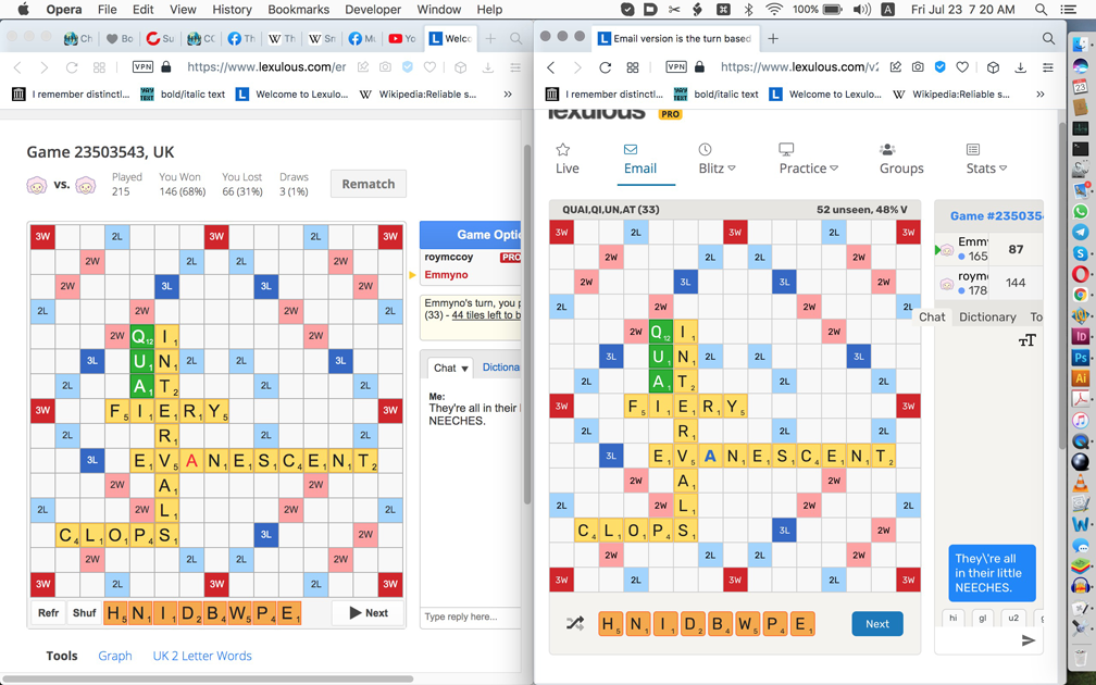
(I had to reduce the Mac 13" screenshot in Photoshop. It was only 600+K, half of the indicated maximum file size 1000+K, but I couldn't place it regardless.)The old layour is on the left, the new on the right. Somebody might think that the new layout looks better, but somebody else may prefer the old one. There is, thus, no remarkable improvement.
The square numbers are smaller in the new layout. Why? Was anyone complaining about their size in the old one? I wasn't. The new ones look spindly, like the tile letters themselves.
A screenshot wasn't or shouldn't have been necessary for these particular two things, but okay, you can see that the rack tiles have a different form than the board tiles in the new layout. I can admit that the rounded corners are nice, but then you have to make them identically rounded on the board also.
So those are the two things for which you requested a screenshot, but now that we have one up:
– I don't like having to mentally reinterpret the shuffle/pass/swap icons. It doesn't require a major mental effort and of course one can get used to it, but there was nothing wrong with the text buttons and I prefer them – again, with the previous "Undo" rather than "Recall", which latter sounds pretentious and I don't like it.
– The blank letters on the board are now blue rather than red. I vastly prefer the red. The blue are no improvement. Please revert to red, the way it was. I don't like the fatter blue letters. Why are they bold, anyway? Was anyone complaining that they didn't stand out enough before? Why should they stand out?
– "Chat" sticks out into the board.
– Can't scroll to right.
– Arrow keys don't work.
– Can't see Settings icon, which should be on the left and the game number should link to something else having to do with the particular game or with numbered games.
– Text-size icon intrudes on chat space (can't see collision here, but they occur). Undesired, as was no problem with size of chat text before. If you want to provide different sizes, this could be changed in preferences rather than constantly taking up space with the undesired icon in the chat pane.
– The two-letter shortcut buttons are 𝘳𝘦𝘢𝘭𝘭𝘺 undesired. Please eliminate or make optional via a preference.
– "Type reply here..." has disappeared. Why? Was anyone complaining about "Type reply here..."?
– "Scribble notes here..." has nonetheless appeared. I'm sure nobody requested this joke, which is not funny after the first time it's seen and not really even then. "Notes" would suffice.
– I have previously commented on the capitalization inconsistency with lowercase "unseen" and uppercase "V". I previously mentioned the possibility of "vowels", but you could also simply eliminate the vowel percentage, which often isn't going to be useful because it doesn't say 𝘸𝘩𝘪𝘤𝘩 vowels and if someone wants to see which letters are left he/she will generally want to do that without being immediately concerned with the vowel percentage.
The new version is playable and I accept it sometimes, but I prefer the old one, will generally continue reverting to it, and hope it remains possible to do so.
-
@roymccoy Apologies for the inconvenience caused. Please share a screenshot of what you can see.
@sakamvari
P.S. I forgot to mention the ugly black arrow. Please restore the previous green one, thanks.
-
@tcm1065
Whoa, pop-up ads. Maybe this explains some of the alleged necessity for change.@roymccoy are all your posts for real?
-
@roymccoy are all your posts for real?
Of course they're for real.
Do you think I'd make up not liking the ugly black arrow?