Horizontal repositioning of blank letters?
-
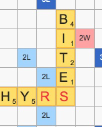
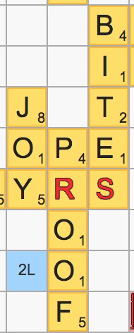
I have commented twice on the visible misalignment of the blank letters on the board, which is worse with the bold blue letters in a different typeface in the new version than with the normal-weight red letters in the old version.
It has now occurred to me, independently of the question of the blank letters' weight, color and typeface, that this could presumably be corrected by adjusting the alignment of these characters so that they are no longer horizontally centered on the tile. There would be a space to the right that is occupied by the letter value in the other tiles, but I don't think this would matter since the extra space is there in the other tiles as well above the value.
I guess I could do a quick photoshop to test this.

How's that? The blank letters aren't horizontally centered, but none of the other ones are either.
Thanks.
-
I have commented twice on the visible misalignment of the blank letters on the board, which is worse with the bold blue letters in a different typeface in the new version than with the normal-weight red letters in the old version.
It has now occurred to me, independently of the question of the blank letters' weight, color and typeface, that this could presumably be corrected by adjusting the alignment of these characters so that they are no longer horizontally centered on the tile. There would be a space to the right that is occupied by the letter value in the other tiles, but I don't think this would matter since the extra space is there in the other tiles as well above the value.
I guess I could do a quick photoshop to test this.

How's that? The blank letters aren't horizontally centered, but none of the other ones are either.
Thanks.
@roymccoy another fine presentation
-
I really hope most of @RoyMcCoy 's posts are meant to be funny. The @Lexulous team has done an amazing job of making this game work without flash. There are improvements in playability almost every day. Most of your requests have nothing to do with that and are just your opinions. You don't like the shape of the
J? The rounded tiles? The positioning of the letters? OK, don't like them then. Seems most either like them or don't care BECAUSE THEY DON'T AFFECT GAME PLAY. -
@roymccoy another fine presentation
Thank you, @sparks. I was thinking of asking whether incremental changes were being made, or whether a totally new version would be released with suggestions implemented or not implemented all at the same time. But I answered my own question by remembering that the alternation between shuffling and alphabeticizing when clicking on the Shuffle button had been changed following my complaint and possibly that of others, apparently independently of any major release version.
So this is apparently a work in progress and ad hoc changes may be made and are occasionally being made. I think the restoration of the normal-weight red blank letter, horizontally aligned with the letters with values, is something that could and should be done sooner rather than later.
A new question arises in relation to all of this: Is the person presently making design choices for the game the same person who originally designed the game in 2007-2008? If he or she isn't, the disputed changes may reflect more a difference of taste between the original and the current designer than anything else. I requested evidence of any complaints about the normal-weight same-typeface red A, none has been provided, and I think that lends weight to this suspicion.
Another question: 𝘊𝘢𝘯 the blank tiles be horizontally repositioned to the left so that they align with the others? I assume they can. This might involve the placement of a transparent digit filling the space of the black ones.
-
I really hope most of @RoyMcCoy 's posts are meant to be funny. The @Lexulous team has done an amazing job of making this game work without flash. There are improvements in playability almost every day. Most of your requests have nothing to do with that and are just your opinions. You don't like the shape of the
J? The rounded tiles? The positioning of the letters? OK, don't like them then. Seems most either like them or don't care BECAUSE THEY DON'T AFFECT GAME PLAY.Flash, as I understand it, never worked on iOS, so all the people who have been playing Lexulous on iPhones or iPads have 𝘯𝘰𝘵 been playing a Flash version. My impression was that Flash has been gone for a while on other platforms as well, so I don't immediately buy the "because Flash" argument in its entirety. I realize there is some problem involved that presumably necessitates some kind of update, but it doesn't seem to be simply Flash.
I don't know where @mapmakere got the idea that I'm unconcerned with changes that affect game play, some of which I have explicitly mentioned. I don't denigrate game-play changes, while he/she does denigrate design changes. So actually the person who is inappropriately giving undue weight to one of the two is @mapmakere and his/her type, not me. My game play has certainly been affected, both positively and negatively, by the new version, and I have hardly ignored this side of the matter.
Finally, I again deny the dismissive accusation that my suggestions are "just my opinions". Some people have openly agreed with my comments, and I'm sure there are a considerable number of others who feel the same way. If certain changes have turned out to be unpopular with players of the game, that's just the way it can go and certain reversions or further enhancements may be in order. I didn't come out with the criticism of the capital J, by the way, but simply supported someone else's complaint in that regard.
-
A thin black outline on the blank letters would be nice, if the resolution on the smaller-screen devices would permit that. Here are the previously displayed letters, aligned with the other letters as suggested above and with a one-pixel stroke. This was done very quickly in Photoshop and is intended only as a rough demonstration of what I'm talking about, but I think it looks pretty good regardless.

@lexulous @sakamvari
Thank you for your support, @Rayger. Black outlines are not foreign to Lexulous, having been used with the classic version's green arrow and gold star, both of which should be restored. Actually the unoutlined red blank letters are fine and I don't think anyone ever felt otherwise, but an ever-so-slight black border would be a nice touch, if possible.
-
@lexulous @sakamvari
Thank you for your support, @Rayger. Black outlines are not foreign to Lexulous, having been used with the classic version's green arrow and gold star, both of which should be restored. Actually the unoutlined red blank letters are fine and I don't think anyone ever felt otherwise, but an ever-so-slight black border would be a nice touch, if possible.
@roymccoy do have to agree with you about one thing. I never see the blank at the end of the game until I have used up all the other letters. A discreet outline would be great or maybe the tile could be different color from other tiles to stand out on the rack
