Lettering and sounds
-
The letters need to be clearer possibly bolder ....quite pale and vague currently
PLUS no volume to indicate change of turn.....
Thx good luck with the improvements -
The letters need to be clearer possibly bolder ....quite pale and vague currently
PLUS no volume to indicate change of turn.....
Thx good luck with the improvements@alicegraciea lettering will be fixed in the coming week. Can you share a screenshot here or via email to [email protected]? It will be helpful. Sound can be turned on from the menu to the right of the game board.
-
@alicegraciea lettering will be fixed in the coming week. Can you share a screenshot here or via email to [email protected]? It will be helpful. Sound can be turned on from the menu to the right of the game board.
@lexulous Lettering improved in one week you said.....that was 27 days ago.....needs to be bold..... so many players quit as it is too hard to play with PALE VAGUE LETTERS/.
-
@lexulous Lettering improved in one week you said.....that was 27 days ago.....needs to be bold..... so many players quit as it is too hard to play with PALE VAGUE LETTERS/.
@alicegraciea Lettering has already been improved. Please share a screenshot of what you see. Thank you. You may post it here or you may please email [email protected]
-
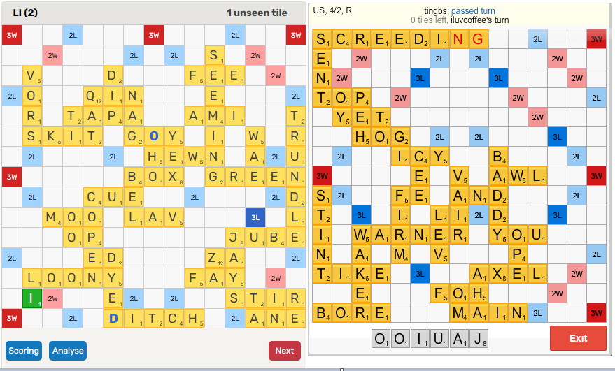
@lexulous I noticed you've made some improvements since the initial v2 release (letters a little bigger, faint outline around the tiles, different 'J' etc), but it's still not what it should be. I made a side by side comparison of the latest board vs the board we all loved. Would be interesting to get some feedback from others. My observations would be 1: The letters on the old board are larger and fit the tiles more uniformly. 2: The previous letters are a very dark black which, along with the larger size, helps them pop and improves visibility. 3: This new board has a weird haze/filter over everything that, along with the worse font, really strains my eyes and prevents me playing for long. Like @AliceGracieA said, everything is too pale/washed out and too small. It is better than it was though.
-
@lexulous Lettering improved in one week you said.....that was 27 days ago.....needs to be bold..... so many players quit as it is too hard to play with PALE VAGUE LETTERS/.
This post is deleted! -
@alicegraciea Lettering has already been improved. Please share a screenshot of what you see. Thank you. You may post it here or you may please email [email protected]
@lexulous letter tiles are much better thank you..only thing is, blanks need more to differentiate between the rack and the blank tiles
-
@lexulous I noticed you've made some improvements since the initial v2 release (letters a little bigger, faint outline around the tiles, different 'J' etc), but it's still not what it should be. I made a side by side comparison of the latest board vs the board we all loved. Would be interesting to get some feedback from others. My observations would be 1: The letters on the old board are larger and fit the tiles more uniformly. 2: The previous letters are a very dark black which, along with the larger size, helps them pop and improves visibility. 3: This new board has a weird haze/filter over everything that, along with the worse font, really strains my eyes and prevents me playing for long. Like @AliceGracieA said, everything is too pale/washed out and too small. It is better than it was though.
@lexulous I agree that the Flash version tile visuals are a lot easier on the eyes. Apart from the things @Dan Mitchell mentioned, I note that the old tiles had some lighter shading, particularly (maybe only) on the top. It gave a sort of three-dimensional look to the tiles. Maybe that was easy with Flash, but harder in code. But if the image for each tile is in a library, maybe it isn't too hard. I think that kind of lighter color, or less saturation, on the top would help. But particularly making the letters more bold and a bit larger to fill more of the square would be nice.
(Is there a technical reason why the old letter images can't just be used? Maybe has to do with using the game on a mobile platform?? -- I have always used the desktop version; I found the phone version on my iPhone Xs was not really usable.) Finally, I do like the new features in V2 a lot; your ongoing changes are making the game asymptotically approaching perfection :relaxed: -
@lexulous I agree that the Flash version tile visuals are a lot easier on the eyes. Apart from the things @Dan Mitchell mentioned, I note that the old tiles had some lighter shading, particularly (maybe only) on the top. It gave a sort of three-dimensional look to the tiles. Maybe that was easy with Flash, but harder in code. But if the image for each tile is in a library, maybe it isn't too hard. I think that kind of lighter color, or less saturation, on the top would help. But particularly making the letters more bold and a bit larger to fill more of the square would be nice.
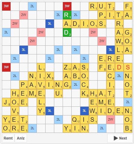
(Is there a technical reason why the old letter images can't just be used? Maybe has to do with using the game on a mobile platform?? -- I have always used the desktop version; I found the phone version on my iPhone Xs was not really usable.) Finally, I do like the new features in V2 a lot; your ongoing changes are making the game asymptotically approaching perfection :relaxed:@laysan You make some good points. Good spot on that shading on the top of the tiles. That was a nice touch. There shouldn't be any limitations to recreating something approaching the old board in HTML5. The email games on the old site actually used HTML5 as opposed to flash and the board was nearly identical (minus that shading you mentioned). Here's a picture:
-
System locked this topic on
-
System moved this topic from Feature Requests on