Striking misalignment of bold blue blank letters on board
-
This looked really wrong:
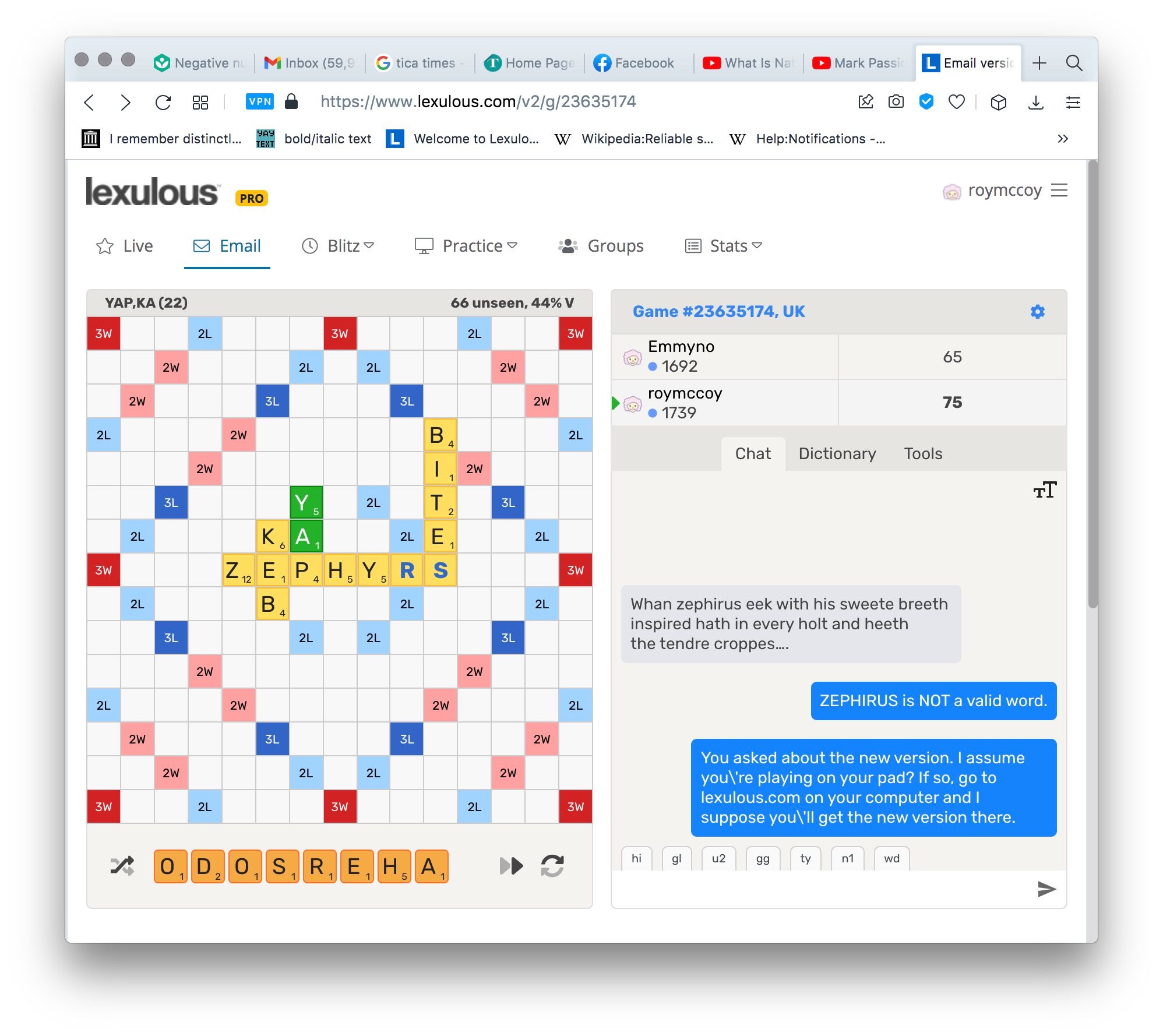
You can see how out of alignment the blue S looks, and is:
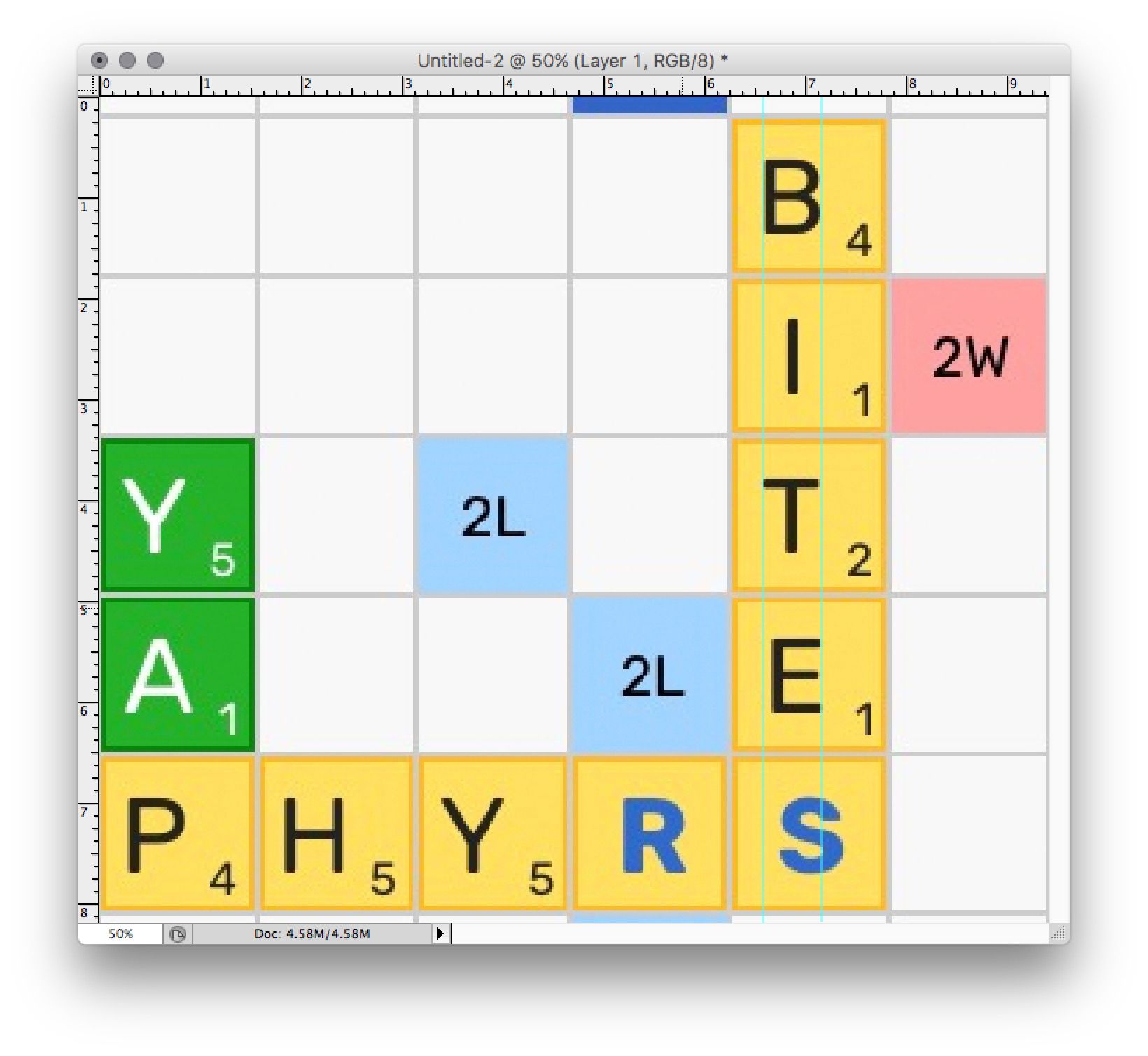
There's also a general optical illusion that the bold letters are smaller. I don't know exactly why that is, but it's mainly because they're in a different typeface. Here's the same board in the old version:
There is nothing wrong with this, in fact it's better, and it doesn't have the problem that the bold letters look smaller and more out of alignment. Please restore the red blank-tile letters in the same typeface as before. I'm a retired typesetter and I know type.I withdraw my prior complaint about the board numbers' being made smaller. They're okay, though they could have been left alone.
Thanks.
-
I agree - many things about the new board are hard on the eye. it's just not as 'crisp' as it used to be and I find I am getting eye strain looking at it for too long.
And wherever did they find a font where the capital letter J only has the cross bar going in one direction (to the left)? The capital letter T has it going in both!! -
@lexulous @sakamvari Please note yet another complaint regarding the capital J. We have the former one by comparison, about which no one ever complained.

-
S sakamvari moved this topic from Feature Requests on
-
S sakamvari locked this topic on