Matching colors
-
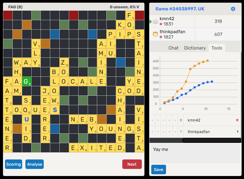
The new graph colors are cool but the head to head colors no longer match like before. This is minor, but as an OCD kinda person, I thought I'd mention it. A nice chance to show off my best ever win as well :)

-
I agree, the colours don't always match.
"Sumtims they duz, n sumtims they is duzn't!"Nice win - don't think I'll want to take you on any time soon. LOL
-
Just for the sake of clarity, what I mean is that my green '1' should now be in orange, same as my graph data, and their red '0' should be in blue.
-
Just for the sake of clarity, what I mean is that my green '1' should now be in orange, same as my graph data, and their red '0' should be in blue.
@thinkpadfan
Yes, I support this feature request - which should be relatively easy to implement.
-
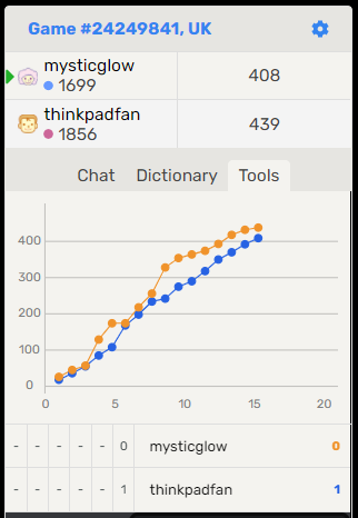
Ha, they sorted the colors out but got them the wrong way round, so the number color doesn't match the graph data for the correct person. Seems wrong on all my completed games so a quick tweak is all that's needed I think. Almost there guys. Thanks.

-
My previous post was slightly inaccurate. There's actually a mix of behavior in completed games. This example is how it should be working. Maybe it's hard to to get it matching consistently.

-
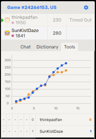
You can also see another bug in the above image: the usernames above the post-game scores are the wrong way round. Or the scores are the wrong way round. Whichever way you want to describe it.
-
You can also see another bug in the above image: the usernames above the post-game scores are the wrong way round. Or the scores are the wrong way round. Whichever way you want to describe it.
@thinkpadfan
The whole graph is wrong compared to the previous one, which showed the player, word and score of each move.
-
System moved this topic from Feature Requests on
-
System locked this topic on
